Every so often, you need to do silly things. Doing these silly things uncorks creativity, provides respite from the mundane, and connects colleagues through laughter.
Thursday Aug 1, 2024 the design and creative teams at Border+Cozy did a silly thing. We time traveled with the help of the Internet Archive’s Wayback Machine and the Web Design Museum. Instead of designing sites and products for clients, we challenged ourselves to design nonsense with extreme constraints:
- You will be given a random year
- You will be given a random subject
- You only have three hours to research and design
- You must present your design to the team
- "Real" work comes first so fit this in when you can
And with that, the games commenced. No, we didn’t have an Olympic torch to ignite the flames of competition, but we did have some custom wheels of fortune.
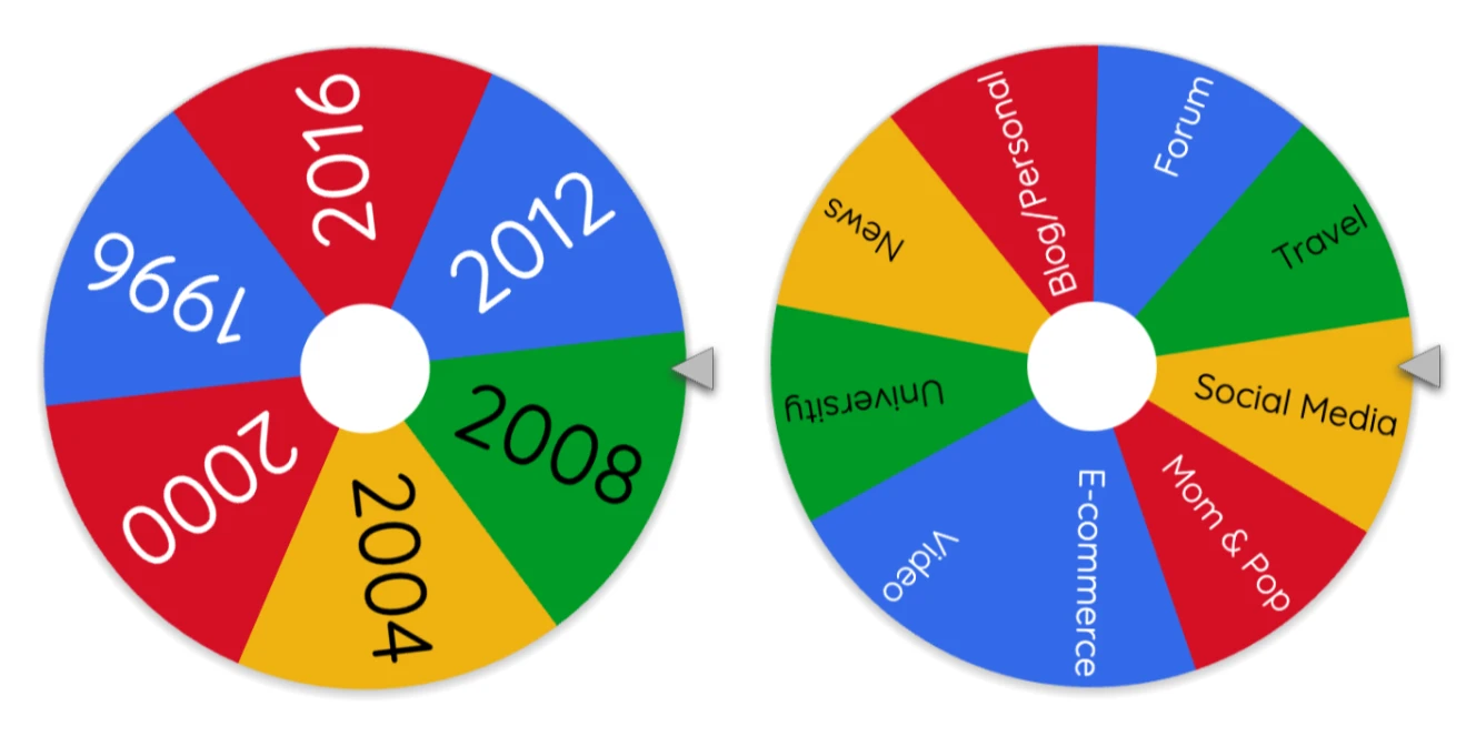
Here are the results in chronological order.
1996 Travel
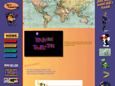
I’ll be honest: I got really caught up in researching 1996. I mean, come on, it’s a gold mine!
I found a ton of amazing stuff. I took a bunch of screenshots and dragged them into Figma. I also found dozens of intense, period-appropriate animate GIFs.
Two travel sites from 1996 were huge inspirations. At that point in internet history, travel websites weren’t like Kayak or Expedia; they were typically more like personal travel logs. So I decided to do “Joe’s travel log”.
I used AI to help me generate a content outline for the page, and then I sketched out a wireframe to get the content laid out on a screen and sort out some of the Autolayout structure. Then I got to the visuals.
The height of design in 1996 was a fixed iframe for a left-rail menu and SO many little animated GIFs with transparent backgrounds. Also: 800x600 resolution, “welcome to my site” headings, saturated colors, super heavy drop shadows, rampant inconsistency, and lots of personal expression.
~ Lee Fuhr
2000 Forum
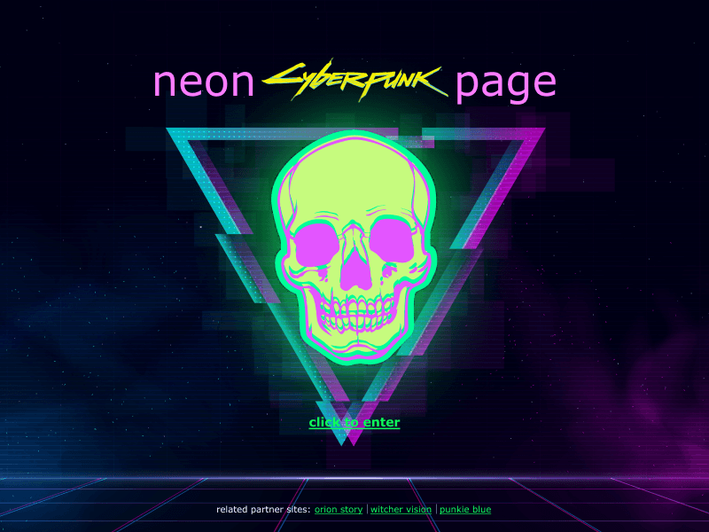
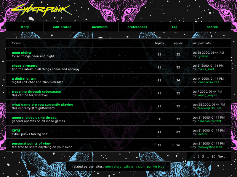
When given the theme of forum design for 2000, I immediately pictured some of the ugliest websites possible. I knew I wanted to focus on a design that looked like a custom-made skin or theme, similar to how many of the music and show forums I visited at the time looked. I felt that embracing the quirky, chaotic, and personality-driven nature of 2000s web design would make for a fun and nostalgic challenge.
I researched technical constraints, design trends, and popular forum topics. I was reminded that 800x600 was one of the most common fixed-width sizes, and Verdana was the most-used font that year. Also, getting a bit over-the-top with design was all part of the charm. Bold color schemes, busy patterns, and abundant graphical elements were user’s ways of expressing their personalities. 2000 is also remembered for the Y2K problem, which manifested an aesthetic of futuristic concepts (dark design, metallic colors, quirky 2/3D iconography).
Post-research, I decided this was an excellent opportunity to create a design for the once-super-popular welcome page, focusing on the cyberpunk subculture (which research would tell me was a hot forum topic at that time). A “click to enter” hyperlink nested between a pink and green neon glowing skull graphic and a pile of links to related partner sites, all placed over a dark background with glows and gradients, were a few of the carefully chosen visuals for this. The forum page was designed with a tiled dark and neon background wallpaper, with semi-transparent dark containers containing Verdana-styled copy sized way too small resting on top. My goal was to create an “awesomely bad” design by practicing restraint while not being afraid to get a little tacky.
2008 E-commerce
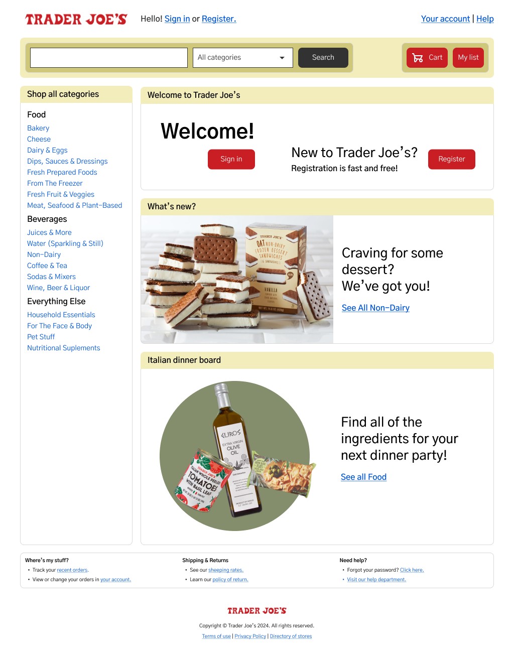
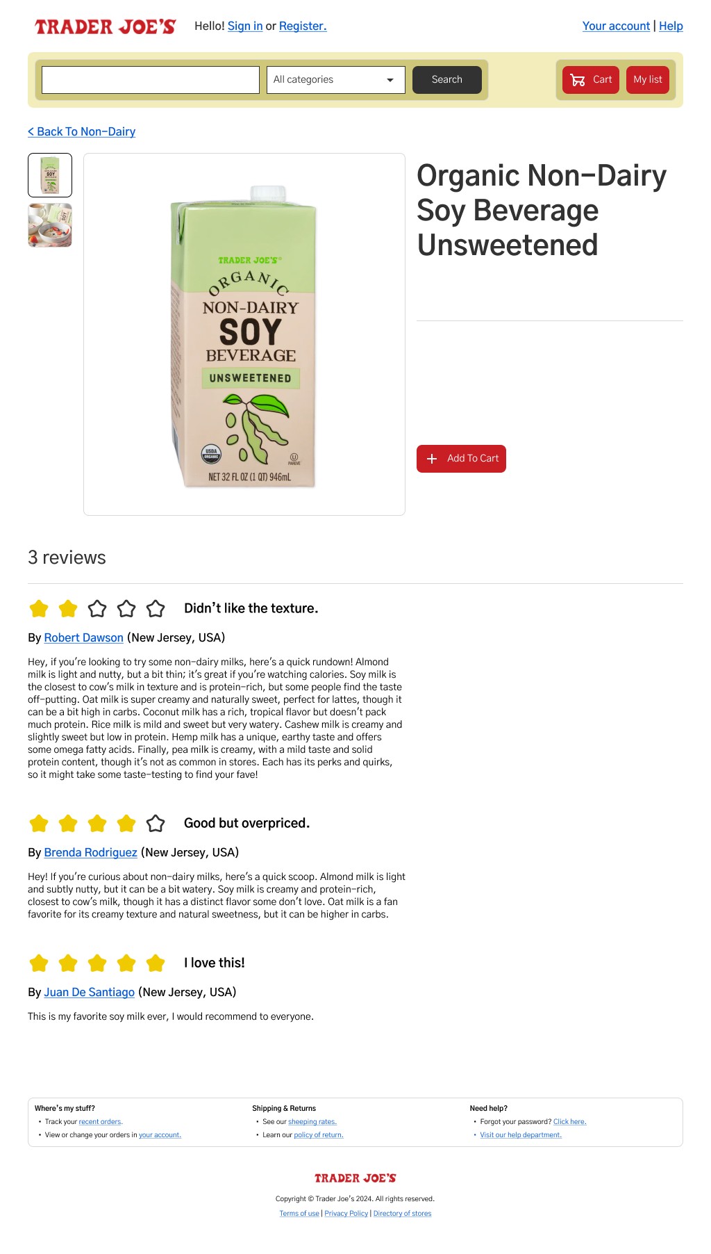
Visiting the Museum of the Internet and discovering these 2008 e-commerce sites was a lot of fun. The sites were filled with blue links and noticeably lacked buttons. I also observed that each section was neatly contained within thick color-outlined boxes.
This experience inspired me to redesign Trader Joe’s website with a similar aesthetic. The layout uses a standard grid system, dividing the content into two columns. While exploring the Museum of the Internet, I found these sites labeled as "clean," which is a bit surprising given their cluttered appearance and odd hierarchies. However, compared to earlier designs from the early 2000s, they did represent an improvement, with a noticeable effort to make the sites cleaner and easier to navigate. They featured clear search bars and dropdown menus for selecting categories, making it simpler to find what you were looking for.
2008 University
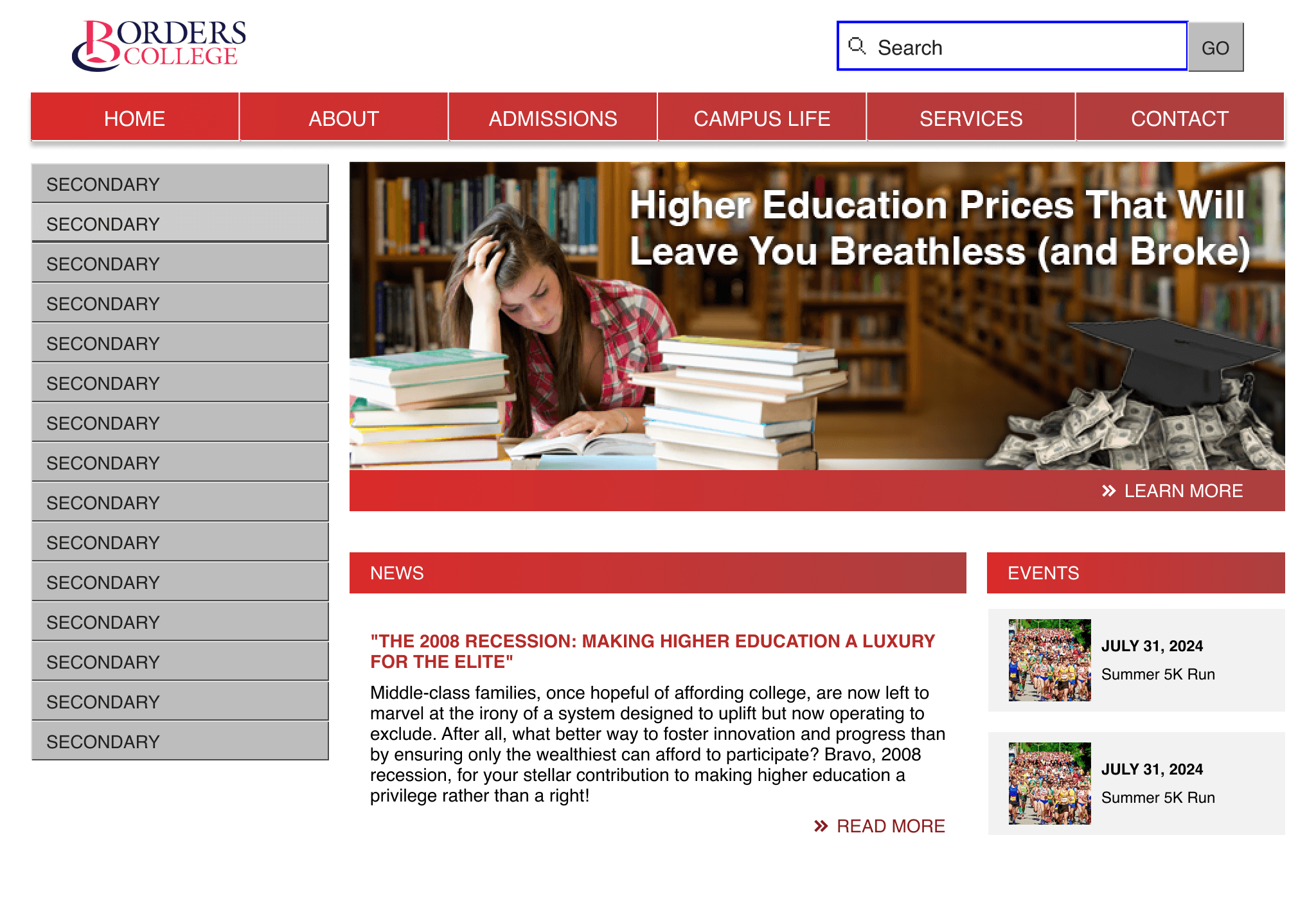
I didn’t have much time for this project and couldn’t finish the homepage. I focused my research on finding the standard resolution for 2008 and discovered it was 1024 pixels. Online libraries were helpful for finding examples. I also researched trending topics of 2008, like the recession, to inspire my design.
I wanted to create a retro library vibe, so I found an old image to edit. I focused on using college and university themes related to student loans and rising education costs. I incorporated lots of borders and gradients to capture the 2008 aesthetic. It was challenging to recreate the exact feel of that time period, especially without clear markers of when design trends changed.
~ Chepe
2008 Social Media
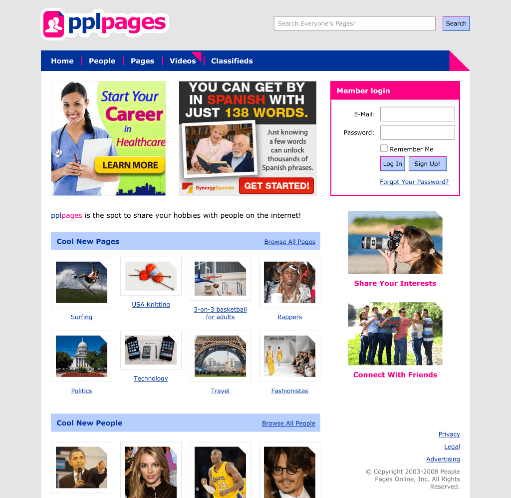
2008 was a pretty epic crossover point for social media. Twitter and Facebook existed, but so did Myspace and other first attempts at online community. There was a trend toward all lowercase logos and dropping letters from brands to secure the domain names, like flickr. Monetization of social media data wasn't yet a thing, so some sites still ran horrible banner ads. Blue links were everywhere and we still didn't know what to call email: e-mail? E-mail? eMail? Yeah, confusing times.
I started with the brand and logo. I wanted to capture all those trends. I munged together the colors and styles of several and pplpages was born. Except I was certain that this was an actual site and, buried somewhere in my subconscious, I was recalling and recreating an actual thing. (If I stole or borrowed from something real, I'm sorry, but also, wow.)
The dog ear needed to be everywhere because 2008 really wanted brand to be something simple like a dog ear. Buttons weren't very styleable, but damnit we sure did try. Oh, and every social media site needed to explain what it was, right on the home page.
- Facebook is a social utility that connects you with the people around you
- Twitter is a service for friends, family and co-workers to communicate and stay connected through the exchange of quick, frequent answers to one simple question: What are you doing? (Ed. I would like to point out that this tag line was 153 characters without spaces.)
- Bebo is a social media network where friends share their lives and explore great entertainment. (Ed. yeah no idea what Bebo is either, you're not alone.)
Things also changed quickly. January's design was completely different from December's later that same year. It was a wild time. Oh, and a nice time. The topics seemed fun, friendly, and welcoming. Things had not yet devolved into the social media cesspool we know now. Wholesome connection was the name of the game. Seriously, Facebook even listed the names of members publicly on the site, that's how friendly.
2012 Mom & Pop
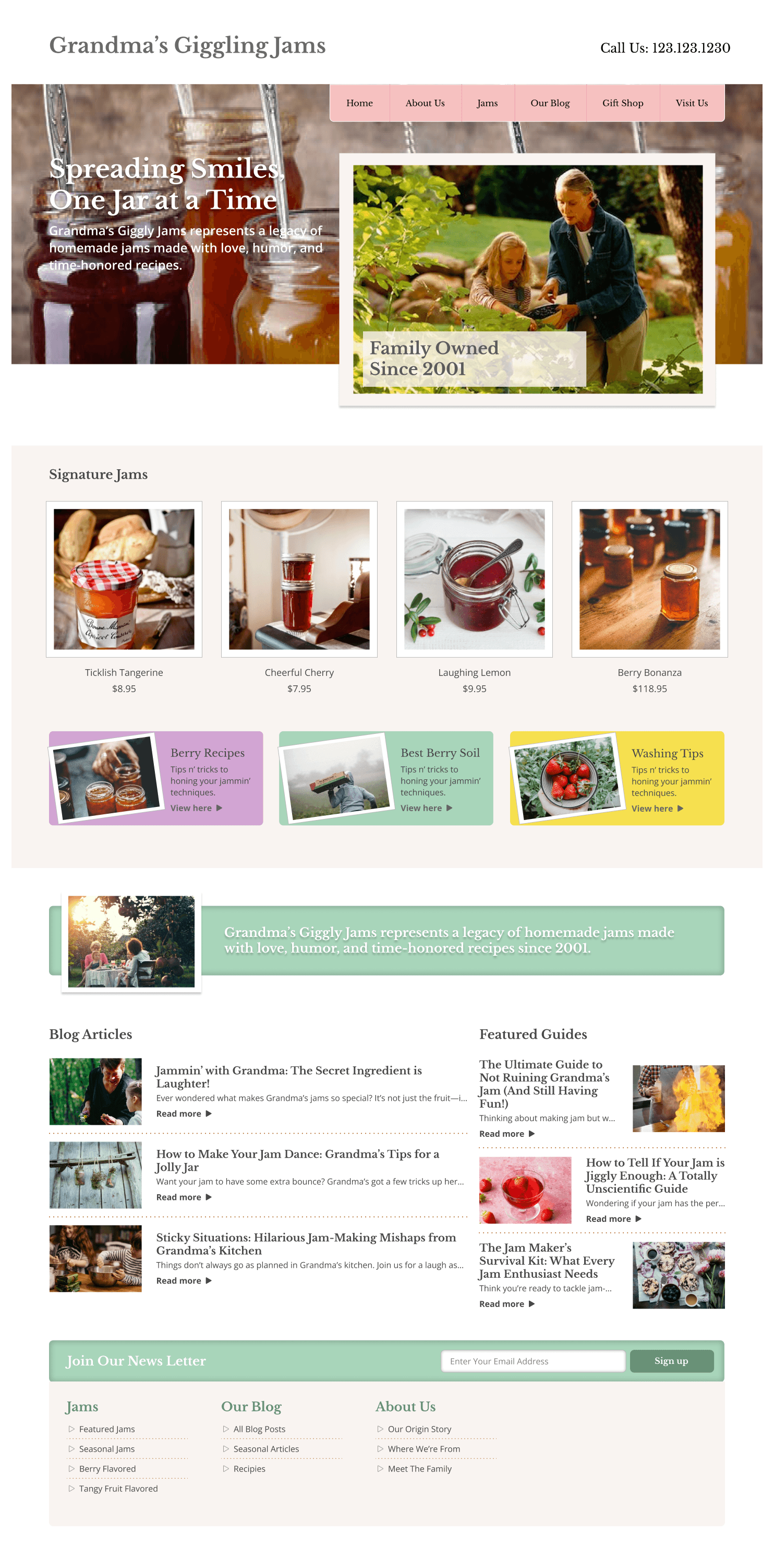
I focused on creating a website for a fictional grandma's jam business, inspired by the design trends of 2012. My research revealed that during this period, large hero sections with attached top navigation became popular. Content had also begun to be organized into clickable card elements with backgrounds and subtle CTAs, marking the rise of the responsive era.
Interestingly, many small family business sites in 2012 appeared out of date, resembling the early 2000s internet era. This could be due to limited budgets, technical constraints, lack of awareness of trends, or prioritizing offline business.
My website design balances modern and outdated elements, drawing from 2012 trends while also incorporating small features from the early HTML era. It includes a large hero section, top navigation, product cards, banners with inset drop shadows, button links and an oversized footer.
This fun project allowed me to explore the evolution of web design and to create a nostalgic yet functional site. By blending modern trends with elements from a previous era, I aimed to capture the unique charm of small family business websites while gaining a deeper appreciation into the history of web design and its later impacts on the user experience.
2016 News
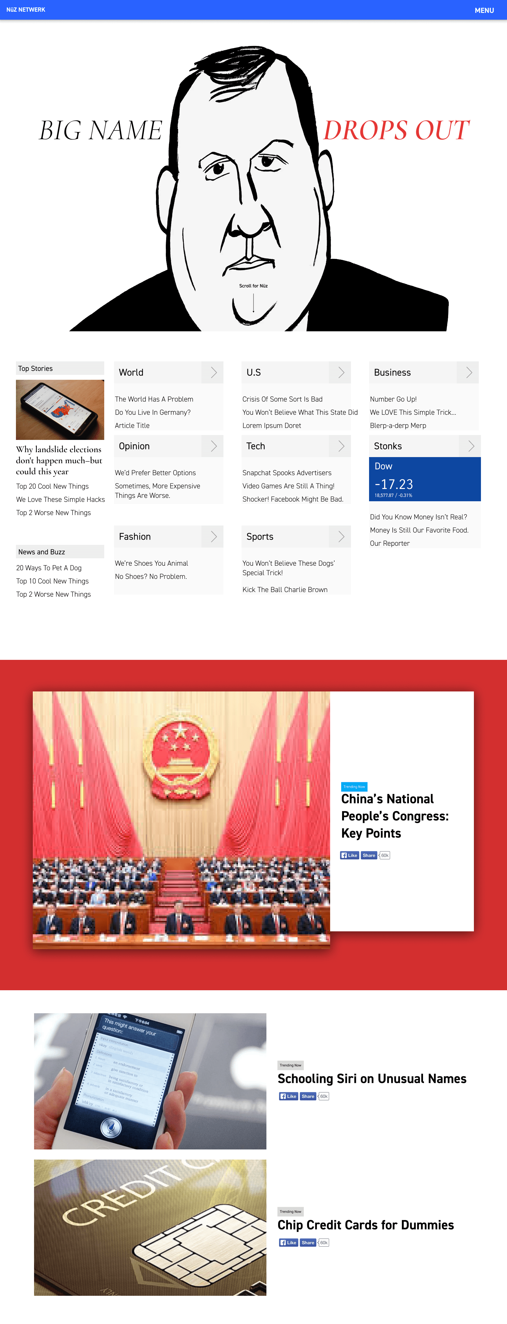
I created a news website from 2016, combining several "designy" trends of the time. I used a full-screen landing screen that the user has to scroll past to get to useful content. I used multiple non-system fonts, since cloud type was becoming more prevalent at the time. I incorporated "scroll-jacking" for moving between full-screen sections. I used material design 1's color palette and shadows since so much of the web was stock material design back then. I made heavy use of card-based components, and filled much of the site with paid clickbait that is hard to distinguish from real news content.