This year, the San Diego and Tijuana regions are proudly titled the World Design Capital (WDC) of 2024, recognizing the innovative use of design to strengthen economic, social, cultural and environmental development. As a cross-border team with members in San Diego and Tijuana, we wanted to embrace this year’s WDC recognition through the redesign of our company website. We wanted to show that Border is more than just a company — we’re a diverse, creative, UX community.
The Border rebranding journey
Our website isn’t just a digital storefront of the services we offer—it’s a canvas, reflecting who we are as an agency. It goes beyond showcasing our expertise by embodying our core values and ethos, serving as a testament to our commitment to quality and innovation.
To celebrate this year’s WDC recognition, we embarked on a journey to reimagine our online presence. Our goal? To create a cohesive experience that not only celebrates the vibrancy of our cross-border team, but also pays homage to the rich tapestry of culture and design that defines our roots.
We wanted to leave a lasting impression. To start, we delved deep into our moodboarding, experimenting with the use of geometric shapes, colors, and dynamic movement to pay homage to design and creativity.
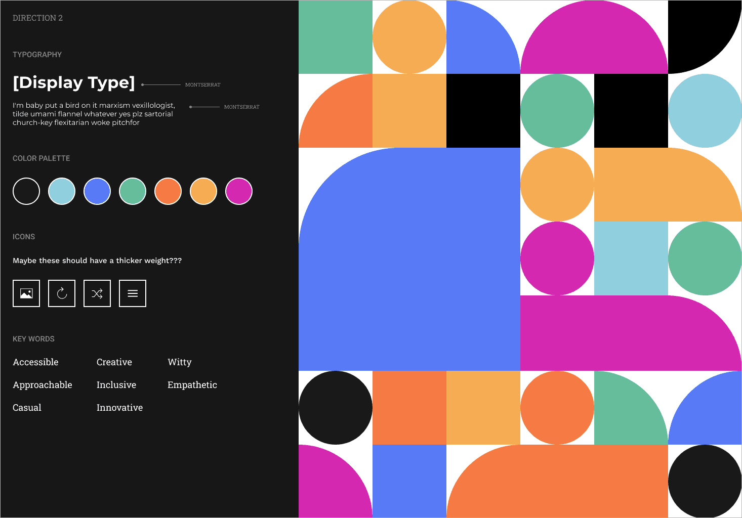
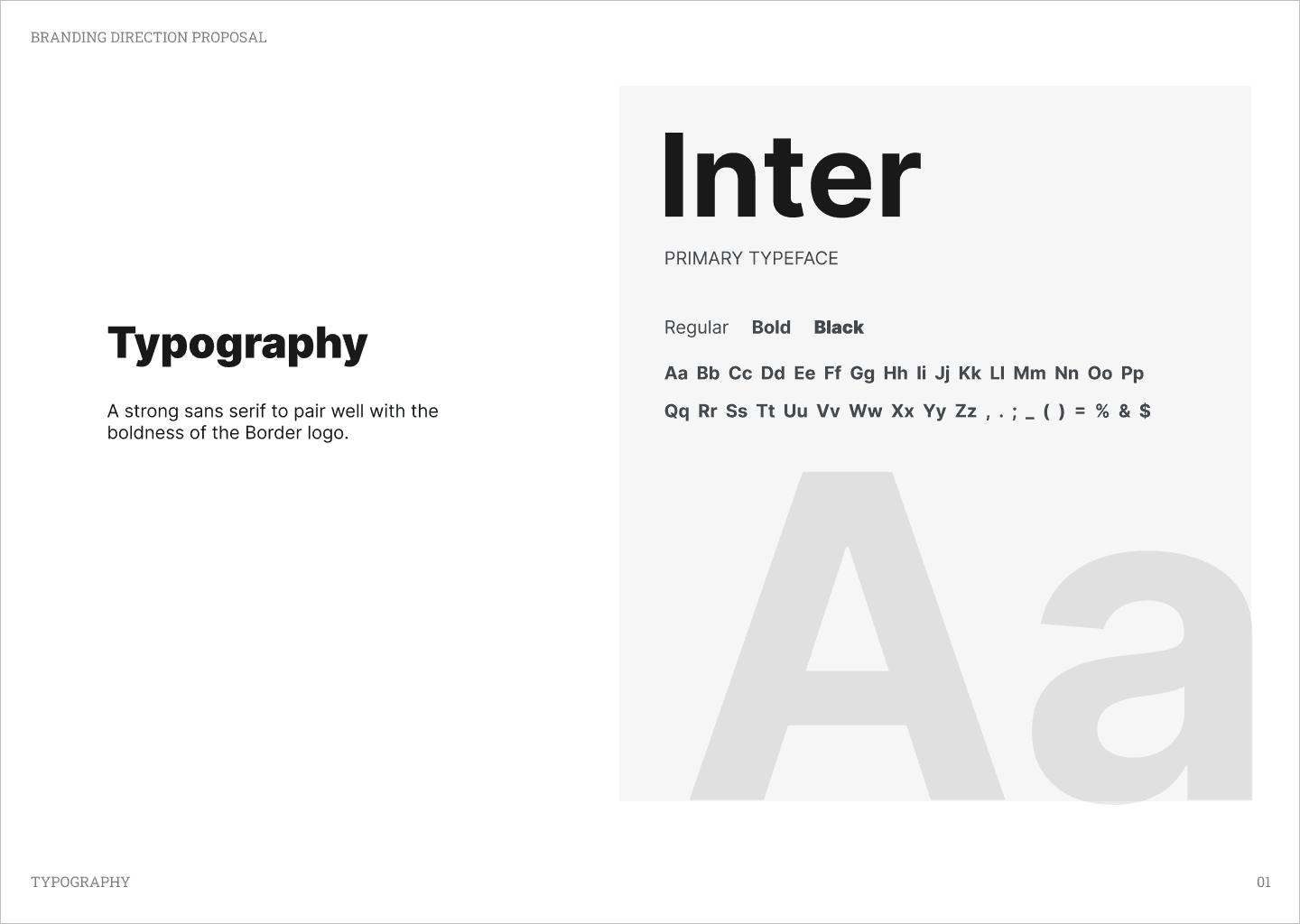
But we didn’t stop there. We wanted to go bigger. To go bolder. Or just go home. Typography became our playground, as we searched for the perfect balance between boldness and legibility. We then settled on one that not only helps us stand out, but also complements our iconic logo, creating a more cohesive visual identity.
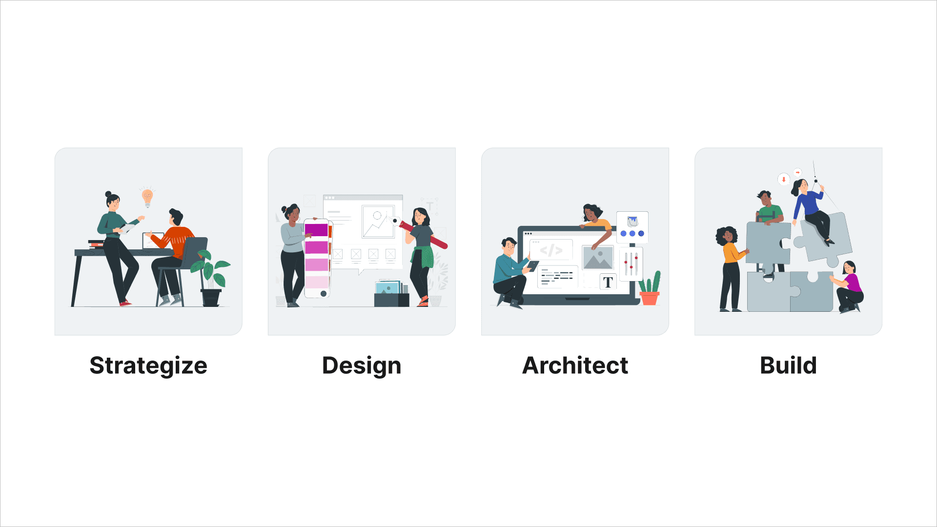
One challenge we faced was how can we maintain our more authentic and personable brand identity? In other words, we were determined not to appear as just another faceless corporate agency, but rather as a team of passionate, creative individuals; in the end, we are human beings behind the brand. To convey this, we found it necessary to always incorporate illustrations featuring people throughout our branding. These illustrations depict human interactions—collaboration, teamwork, and engagement with clients—highlighting the human aspect behind our work and emphasizing our commitment to legitimacy and personal connection.
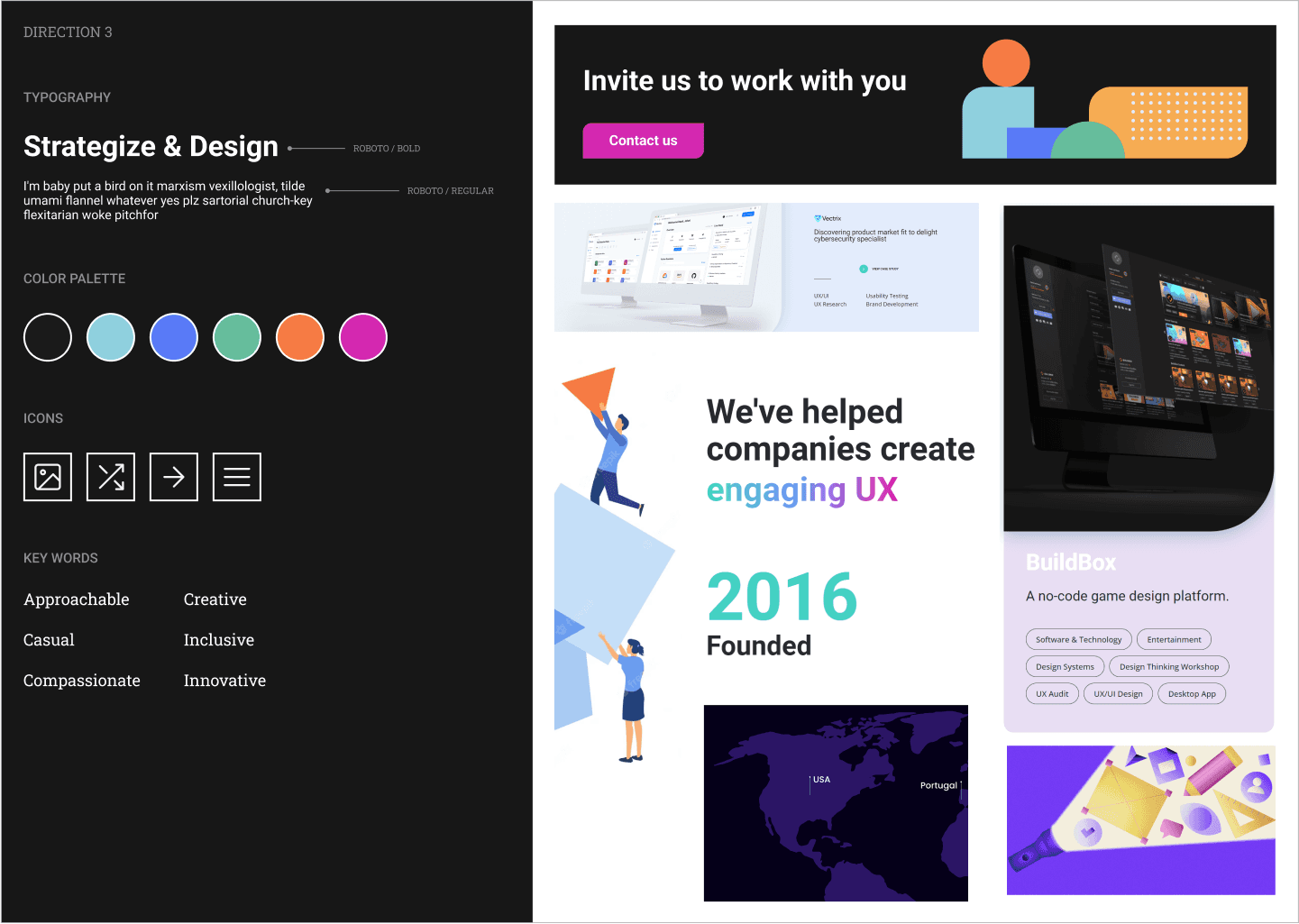
Leveraging our newly developed visual elements like colors, typography and illustrations, we expanded our branding to company presentation slides. This was a logical next step in helping to solidify our new visual identity as an agency. We recognized the importance of presentations as key components in conveying our brand essence to future clients and partners. Our slide decks were created as customizable templates in Google Slides. This was to ensure that anyone in the company could easily curate their own stories or decks while ensuring adherence to the brand. By maintaining consistency across all various materials, we helped to amplify our genuine image and impact in presentations.
Transitioning from slide decks to our website, we unified all of our branding elements for our new online landscape. We maintained our witty tone within the content while enhancing it with bold typography and graphical elements. Each page boasts its own palette and shapes, offering a distinctive experience with every click. These elements help to inject energy while celebrating design and creativity.
With our website, we took it one step further. Our goal was to craft a truly unforgettable hero experience—one that captivates our audience, ignites their curiosity, and leaves a lasting impression. As Aaron articulates in his article, Art for Art's Sake, we were determined to make our website's hero space more than just a visual display selling what we do.
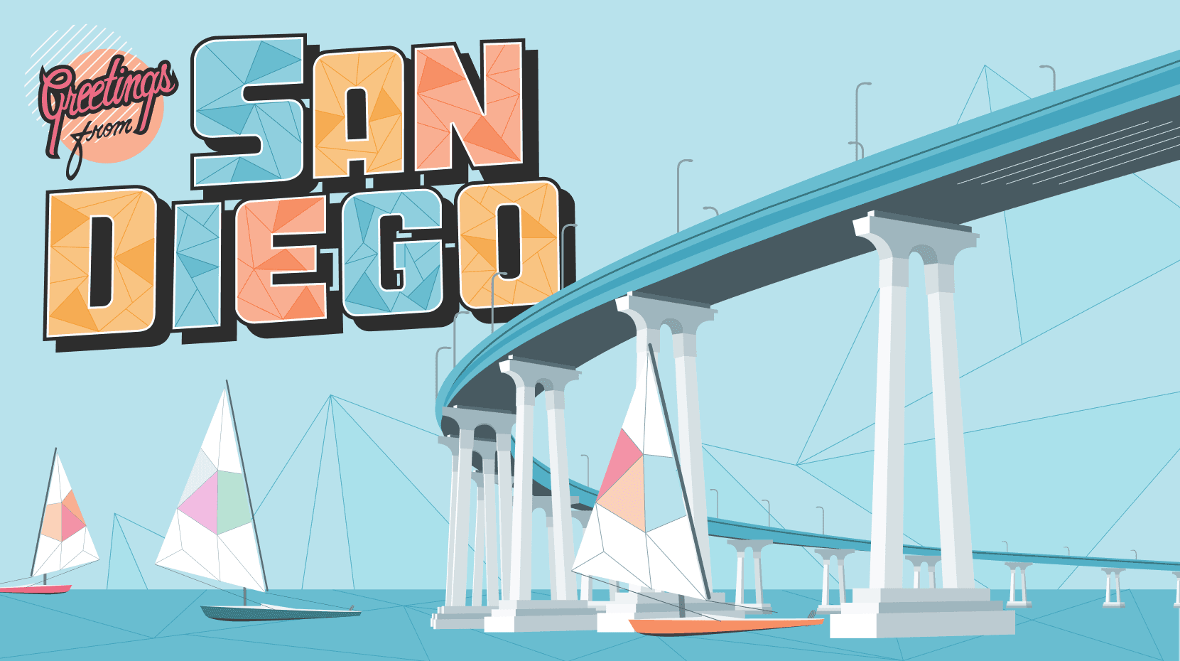
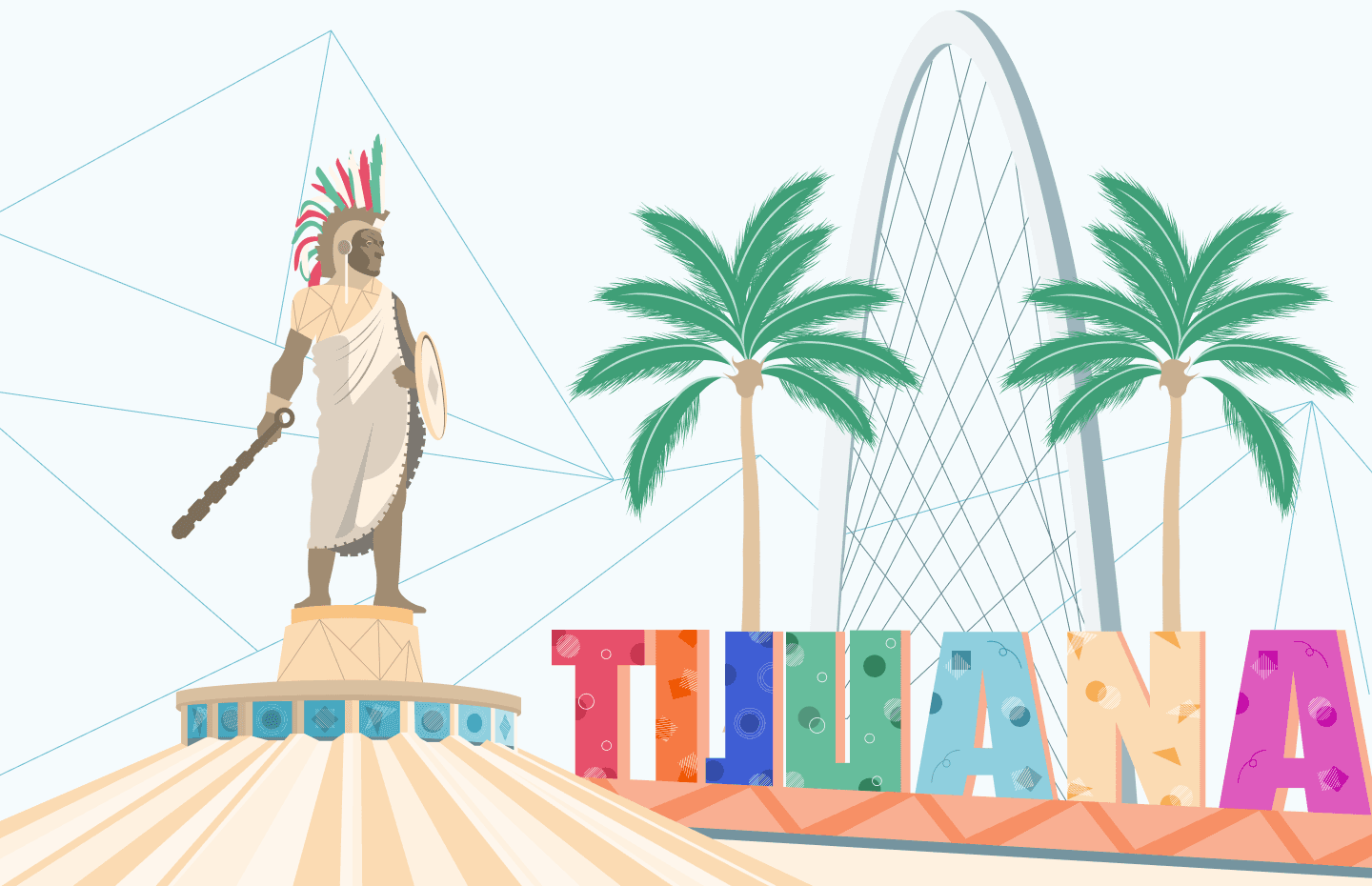
To achieve this, we embarked on a journey to express our roots. We created geometric illustrations of the San Diego and Tijuana regions, infusing each design with our geometric shapes and vibrant colors. These illustrations serve as more than just aesthetic elements; they're windows into revealing who we are, where we come from, and what we stand for.
Overcoming technical hurdles: From Webflow to Framer
After designing our awesome new website, we knew we needed a good tool to host it for the world to see. Initially, we chose Webflow for its flexible CMS and no-code design features.
However, we kept running into little pickles. Our custom code failed to work and our site speed diminished due to the constant rendering of Java Script-only animations. There were even frequent crashes while working in the designer tool. However, the biggest problem of all, is that no two designers can work on a single project simultaneously. What began as minor issues escalated into time-consuming dilemmas, leaving us grappling with frustrations and setbacks. We knew we needed to find an alternative. Particularly a more collaborative tool. After all, we are a design agency, and often work as a team to get things done faster.
That’s when we found… Framer.
The transition to Framer was a game-changer. It’s another web builder tool, with a face lift that looks very similar to Figma (our primary design tool when building client products). With its collaborative ability and a more intuitive user-interface, Framer allowed us to unleash our skills like never before. With Framer, we were able to streamline our workflow significantly, reducing our turnaround time from a lengthy three weeks with Webflow to just one week, starting from scratch and completing the redesign project.
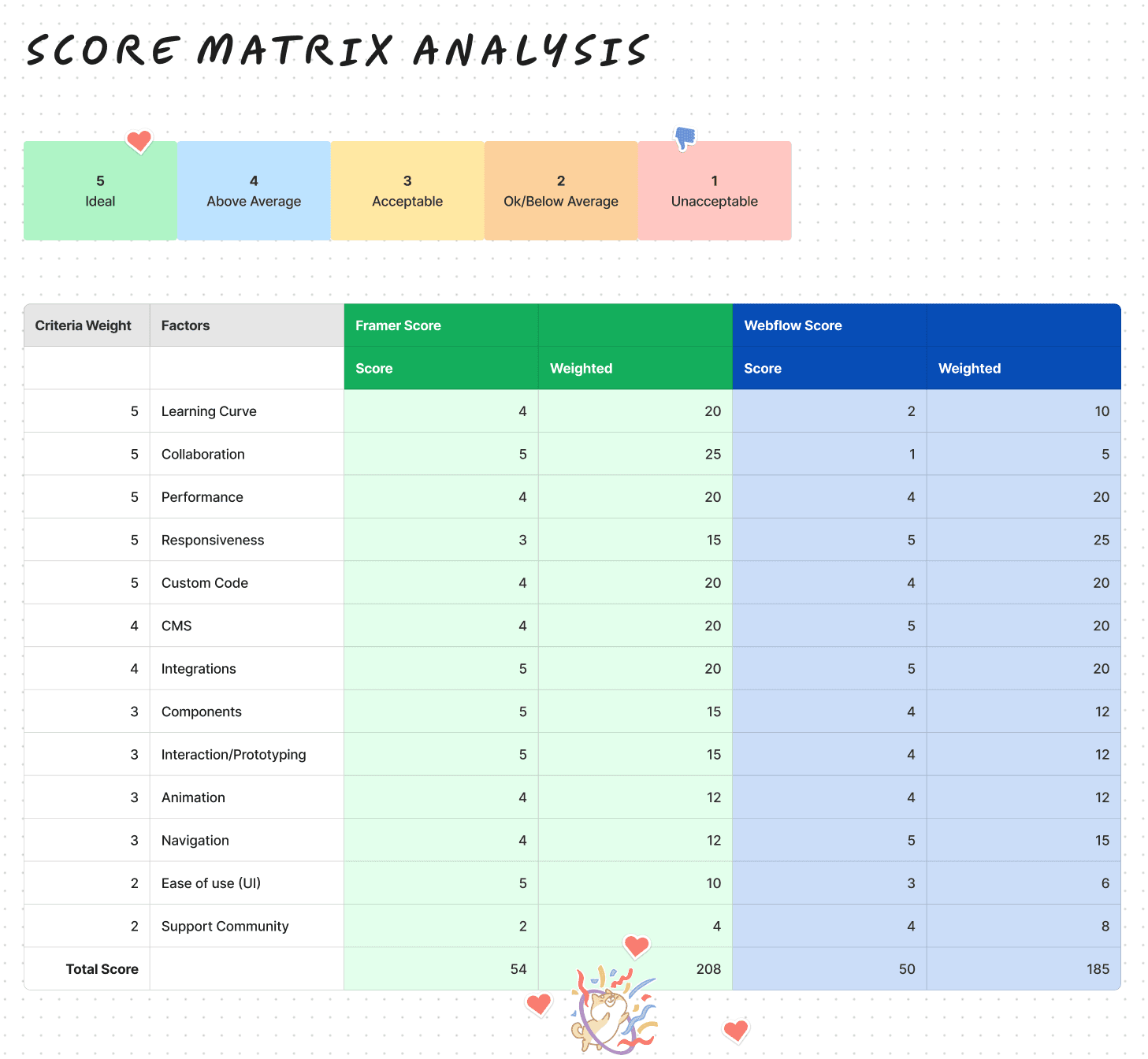
To further solidify our decision between Framer and Webflow, we created a score matrix analysis. We asked questions tailored to our needs as a collaborative design agency, covering factors like:
- How easily can a user learn the tool and continue to use the tool without guidance
- How well does the tool handle multiple pages, components, CMS, code, etc?
- How well does the tool allow designers to accommodate multiple breakpoints? Is it customizable? Does it have responsive control settings?
- Does the tool allow the ability to add custom HTML, CSS, and JavaScript? How is the ease of implementing custom code and managing assets within the tool?
- How does it allow designers to control creating CMS items and collections? Can you make connections? Can you customize fields?
- How easy is it to navigate the UI and use the tool in general (understanding the features)?
- Does the tool have a community for support?
- More
These questions helped us assess the long-term suitability of each tool for both internal and client work.
Then we broke-down and organized these questions into categories, or key factors. Each factor was weighted on a scale of 1-5, based on its importance: “1” being least ideal for our agency’s needs and “5” being the most ideal or most important need to consider.
Finally, we placed and weighted the scores to determine the crowned winner for our requirements!
From designer to code: Embracing new skills
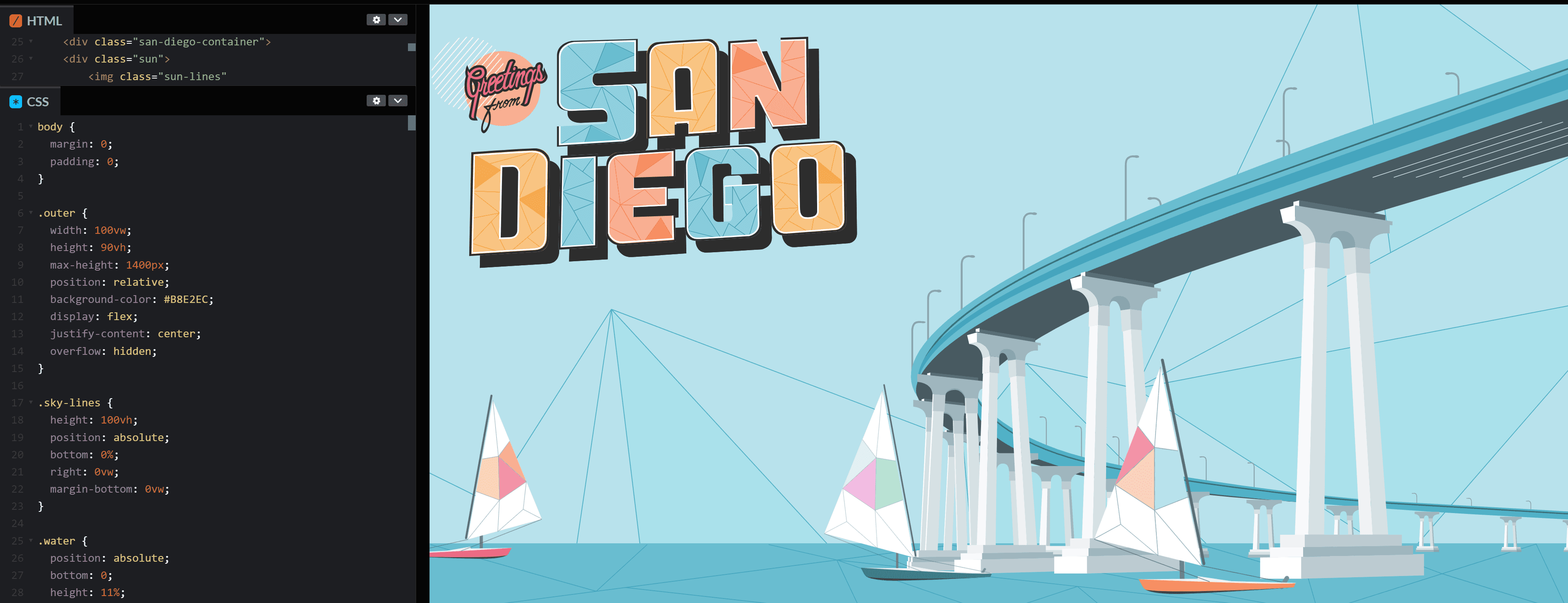
We believe in pushing boundaries and continuously expanding our skill set. And as designers, we try to understand the importance of bridging the gap between design and code. At Border, code is as important as design, so that’s why we took it upon ourselves to enhance the hero illustrations of our website using basic CSS and HTML. We wanted to make our hero section more fun and meaningful, embracing our local San Diego and Tijuana roots. After all, why limit ourselves to just one realm of creativity when we have the potential to explore or excel in both?
To bring our vision to life, we used an online code editor, CodePen, to help build our animated hero illustrations. We imported all of our Figma assets via HTML, re-positioned our elements with CSS properties, and with the magic of CSS @keyframes, we added movement to our illustrations, transforming them from static images into visual experiences.
The transition from designer to dabbling in code was both intimidating and challenging, coming from a no-code background. However, it ended up being an incredibly rewarding experience. It allowed us to explore new possibilities and redefine the boundaries of what we could achieve in terms of digital art animation and storytelling for our website.
But why dedicate time to learning code and animation as a designer? Animation isn't just about immersing the user experience; it's a means to help express ideas. As designers, it's crucial to articulate our vision clearly to our development team. By mastering code and animation, we can empower ourselves to enrich the storytelling aspect of our designs with the precise animations we envision. At Border, we very much try to blur the lines between design and code.
There are a wealth of CSS and HTML resources for other code newbies out there, such as MDN Web Docs, providing invaluable documentation on a wide range of basic CSS and animation properties.
Looking ahead
The journey to redesigning our website was an overall humbling experience filled with many challenges and triumphs. As we reflect on our process, several key learnings stand out:
Flexibility is key: While Webflow initially seemed like the perfect choice to host our website for its CMS flexibility and no-code features, we learned the importance of adaptability when technical challenges arose. Being open to exploring alternative tools like Framer allowed us to overcome obstacles and streamline our workflow.
Embracing new skills: Dabbling in code as a designer can be daunting, but ultimately rewarding. We not only enriched our website’s visual appeal, but also learned a new skill that can be expanded upon, especially when it comes to effectively collaborating alongside our developers here at Border.
Collaboration is essential: Finding a tool like Framer that promotes collaboration was crucial for our team's efficiency. The ability to work together in a single environment significantly excelled the design process and enabled us to deliver a consistent end-product of our website.
Continuous learning: Our journey doesn't end with the completion of the Border’s website redesign. We recognize the importance of continuous learning, honing our skills particularly with these new tools like Framer and CodePen. These resources not only enhance our capabilities, but can also help us tackle future projects as we adopt them as tools for our agency.
As we put the final pixels in place for our website makeover in the midst of San Diego and Tijuana's reign as the World Design Capital of 2024, we're not just "signing off" on a new look. We're sealing a pact as a team to keep pushing boundaries, embracing challenges, and providing value into every pixel in what we do.